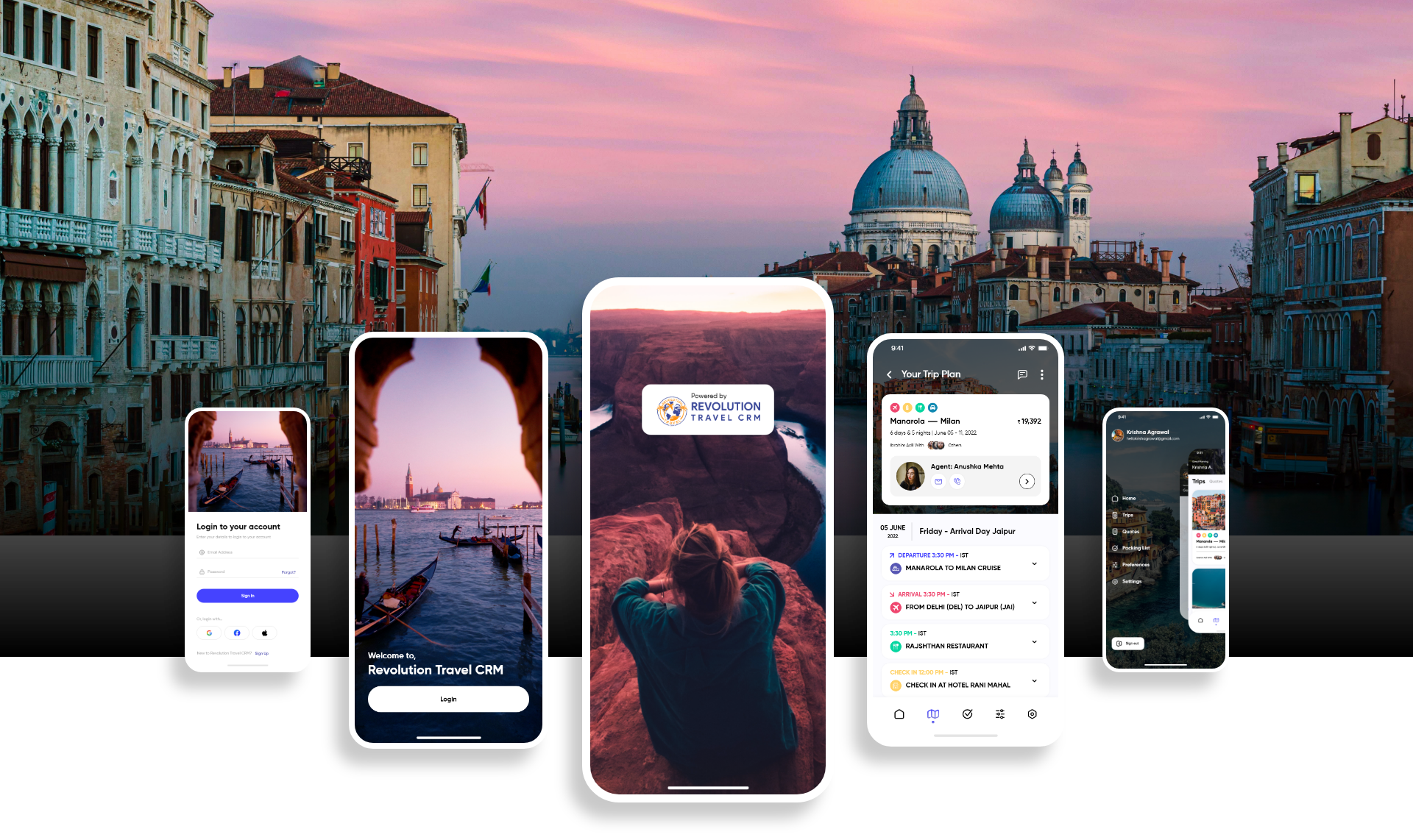
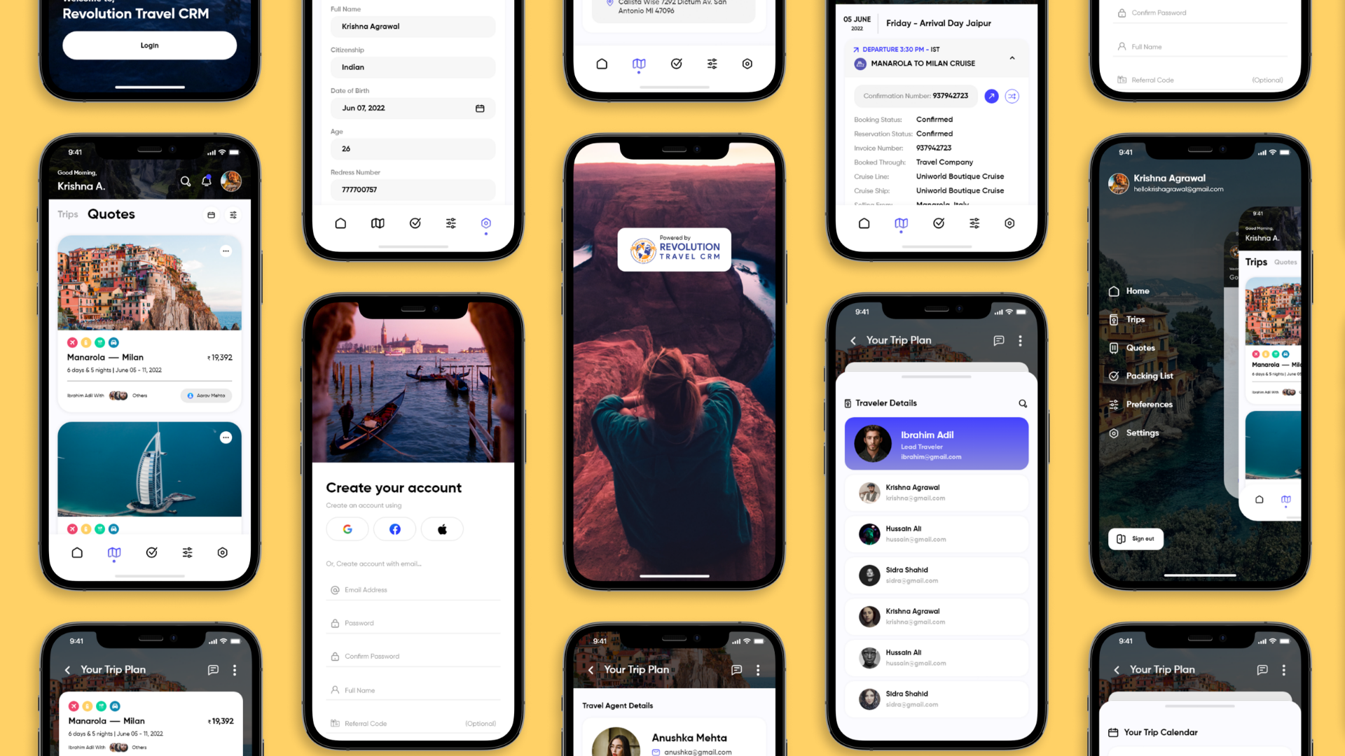
Revolution Travel CRM is a mobile-first travel platform designed to help users discover destinations, book trips, and manage itineraries in one unified experience. The project focused on reducing friction in the booking journey and improving post-booking visibility through a more structured and scalable UX.
UI/UX Case Study
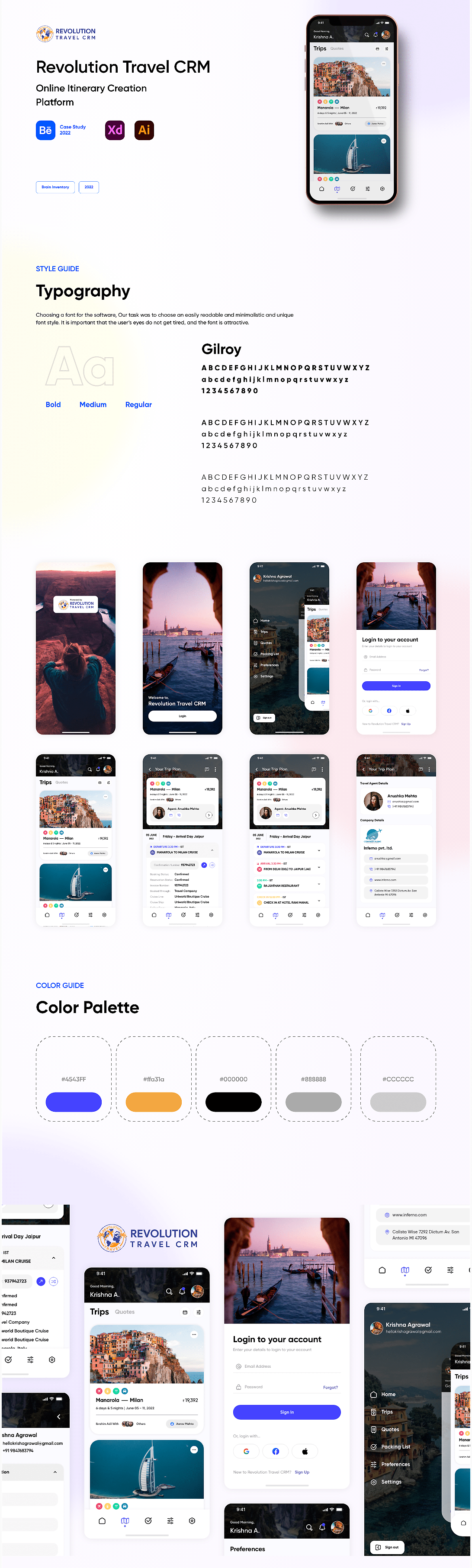
Revolution Travel CRM
Category
UI/UX Design
Project Duration
3 Months
Start Date
2 Jaunary 2023
Designer
Sumit Barapatre
Overview
My Role
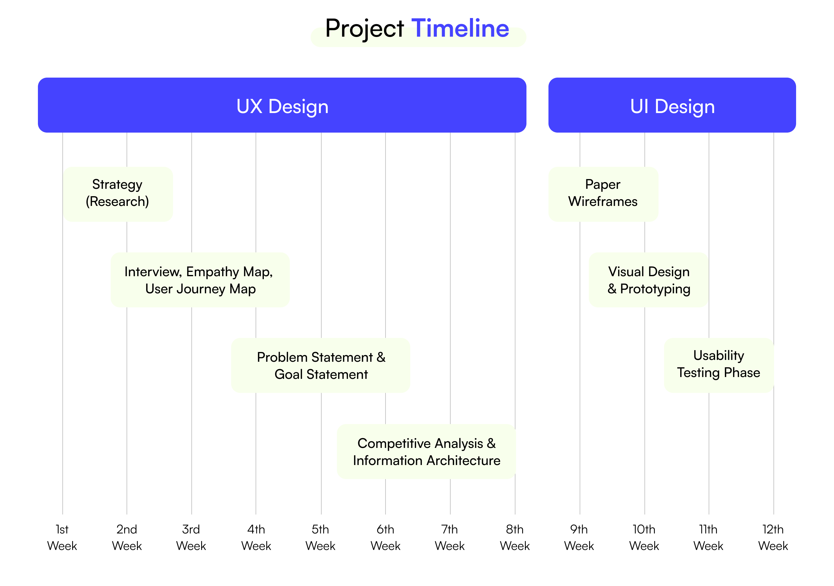
I led the end-to-end UX/UI design of the mobile experience, working closely with product and engineering to define user flows, improve usability, and establish consistent UI patterns. Responsibilities Owned UX from discovery to high-fidelity delivery Partnered with Product Manager and developers Conducted UX audit of existing flows Designed scalable mobile components Prepared developer-ready Figma files Team: PM + 2 Developers + Designer (me) Timeline: (add yours)
problem statement
UX Approach
I tackled key user challenges and refined the automation experience through a structured UX approach, grounded in real user feedback, behavioral insights, and continuous iteration.
RESEARCH & DISCOVERY
Evaluated existing travel booking patterns
Identified friction in destination browsing
Reviewed user expectations for mobile travel apps
DEFINITION & IDEATION
Mapped core journey: Explore → Book → Manage
Prioritized high-impact usability gaps
Defined improved information hierarchy
DEPLOYMENT & ITERATION
Designed mobile-first responsive flows
Built reusable component patterns
Iterated with stakeholder feedback
Understanding User Behavior
Initial analysis revealed key friction points in the travel journey:
Users struggled to quickly compare destinations
Booking steps felt cognitively heavy
Trip details were difficult to scan post-booking
Visual hierarchy was inconsistent
Navigation lacked clear progression
These insights shaped the redesign priorities.
Solution Strategy
Guided Travel Experience
Goal: Create a smooth end-to-end journey from discovery to trip management.
➤ Simplified browsing patterns
➤ Reduced booking complexity
➤ Structured trip information
➤ Standardized UI components
A more confident and fluid travel experience across the lifecycle.
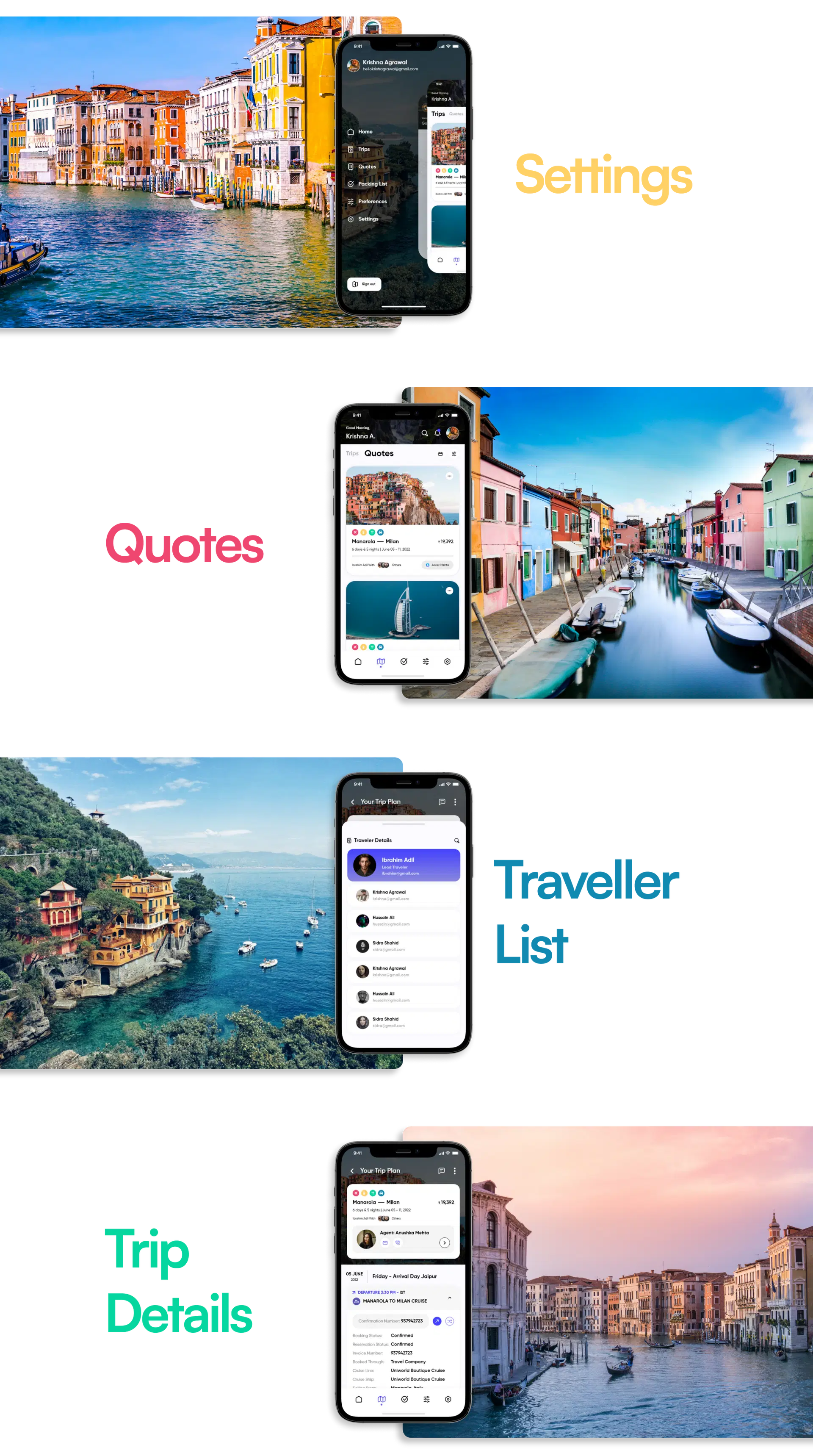
Navigation Flow
Explore → Select → Book → View Trip → Manage
➤ task continuity
➤ decision clarity
➤ flow predictability
➤ user confidence
Key Design Decisions
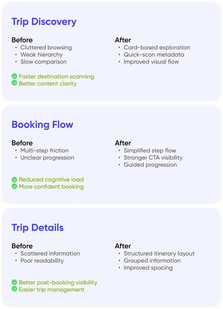
➤ Prioritized card-based browsing to reduce cognitive load during destination scanning
➤ Introduced progressive disclosure in booking to prevent user overwhelm
➤ Structured trip details using grouped information blocks for faster glanceability
➤ Standardized spacing and typography to support mobile readability at scale
Trade-offs Considered
Sketches & Exploration
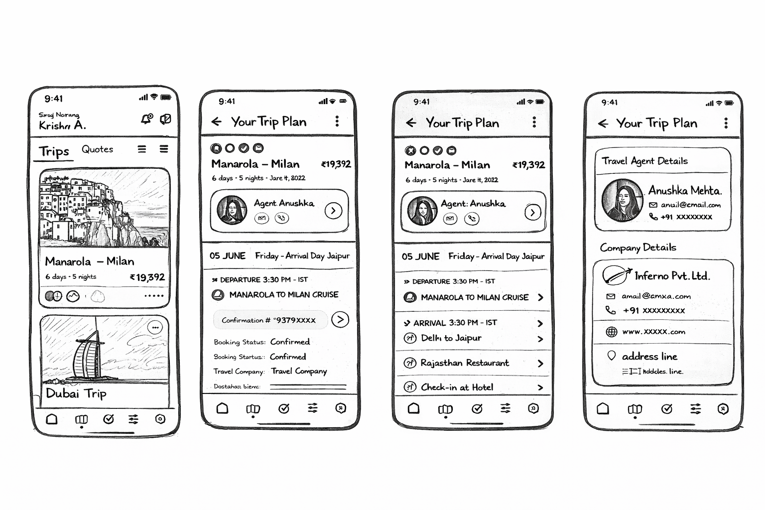
➤ destination card hierarchy
➤ booking step reduction
➤ mobile readability
➤ quick-scan information layout
Multiple layout directions were tested before converging on the final mobile pattern.
Wireframe & prototyping
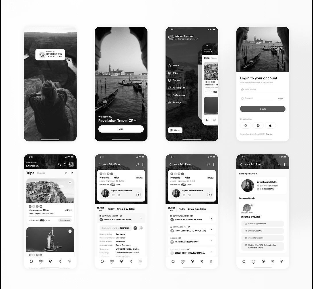
➤ validate booking flow clarity
➤ test navigation comprehension
➤ align stakeholders early
➤ reduce development ambiguity
Iterations primarily targeted cognitive load reduction during booking.
Final Design System
Key Experience Improvements
Design Impact
System Thinking
Outcomes & Learnings
➤ Travel apps demand extremely strong visual hierarchy
➤ Progressive disclosure reduces booking friction
➤ Component systems improve scalability
➤ Early product–engineering alignment speeds delivery